Public displays offer communities a window to information. But they also offer researchers a window into understanding communities. Over the past few years, research at the University of Oulu led by the Ubioulu consortium has investigated a number of ways in which public displays can be more than just “displays”. In this article we summarise some of our most exciting findings from this effort.
Historical perspective
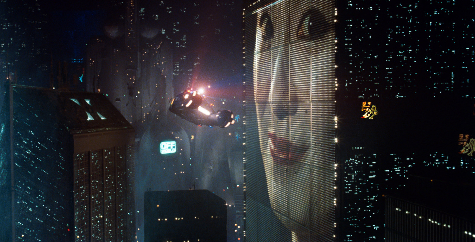
Public displays have a definite science fiction allure to them. All too often, we’ll see a film set in the future, and the protagonist will walk down a street surrounded by flying cars and suddenly come across a huge public display. Films such as Blade Runner, Back to the Future, and Minority Report feature such displays but with varying philosophical connotations. In some cases, the displays are depicted as the epitome of advertising and corporate power mingling with public affairs—people just can’t get away from the displays. In other cases, they offer entertainment or useful information and services.
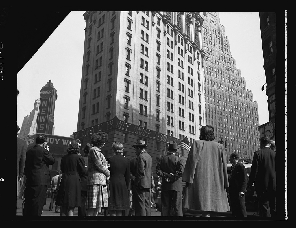
Back in the real word, technological advances in this area have been steady, and new types of display technologies are emerging in the urban facade. The ability to scale up public displays has historically been limited by the constraints of CRT technology. One of the first public displays wasn’t a research installation but rather a commercial installation for showing breaking news. The Motogram or “zipper” in 1928 encircled the facade of the New York Times building to display breaking news using light bulbs in a dot-matrix-like fashion. Public displays in stadiums, airports, train stations, and bus stations soon followed.
Some advances were made using various low-resolution media during the 1980s and 90s to create large animated displays for advertising and promotions. However, only with recent advances in plasma display technology has digital signage become capable of displaying full-size video streams. In recent years, public displays have become a major business, and research in the area is buzzing. A recent special issue of Computer offered a rich retrospective and thoughtful outlook of research in this field (including ours), covering issues such as interaction techniques, infrastructure development, advertising, and transitioning to multipurpose public displays
Advertising has been a big driving force behind the proliferation of big displays in urban spaces. These technologies are also being used for civic engagement, with many public squares, parks and plazas hosting public displays with non-commercial information and services. Finally, novel form factors and materials are being used with public displays. For example, shape-shifting displays have recently made an appearance in public locations. A big shape-shifting display has been installed outside Munich airport, and uses a combination of LED panel and mechanical arms to achieve a “Transformers-like” effect.
Do people know what they want?

In a paper we published in 2013 we show that asking people what services to put on these displays can be misleading. To demonstrate this, we first conducted a series of studies where we collected attitude and preference data about the types of services that citizens in our city wanted to see on public displays. Analysing this data we came up with 10 services that in some way or another citizens wanted. We then conducted a follow-up study were we asked citizens to rank their preference of these services, in order to try and predict which of these services would be the most popular on the displays.

Eventually we actually deployed public displays in urban spaces in our city, and we implemented all of the services that we identified previously. We then waited for about a year, during which time we were collecting data on which of these services were used the most, and which were used the least. Finally, we compared this outcome to the prediction we had made based on citizens’ opinions. We found that there were multiple services that people thought would be useful but turned out were not.
For example, most people said they would love to have a service to find bus and transport schedules, a service to find out about events happening in the city, or places to eat. It turns out these services (bottom-right in the figure) were some of the least used. On the other hand, the news and game services (top-left in the figure) were deemed to be not that attractive by citizens, but it turns out they are some of the most popular on our displays. What these results show is that it can be really hard to identify popular services to deploy on these displays, and most likely a trial-and-error approach should be expected.
How to cram multiple applications onto a public display
A very unique characteristic of our public displays is that they are “multipurpose”. Unlike many public displays that just do one thing (or run a single application), our displays were designed from the ground up to host multiple applications, and allow passers-by to launch the one they are interested in. Think of these displays as a giant iPad standing in the middle of the street.
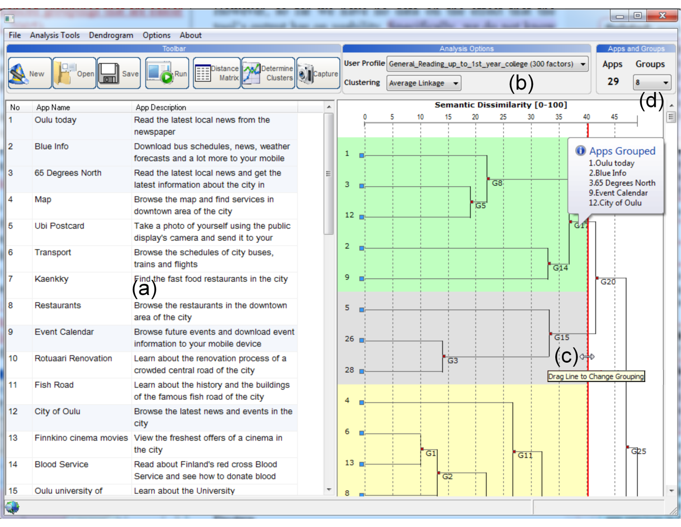
An important question is how to design the application menus for such displays with multiple applications? People are very used to grouping and ordering the applications on their personal phones, but this cannot happen on a public display with two dozen applications. One size must fit all. In collaboration with researchers from the University of Patras we tested a tool called AutoCardSorter that can provide an automated grouping. This tool was adapted to take in a list of all the applications that we have available on the public displays, along with a brief description of the application. By analysing the textual descriptions of these applications, the tool provides a recommended way to group all the applications — in other words it suggests the categories in which the applications could be grouped. A study we conducted showed that this grouping seems to be at least as good as what a human can come up with. This is great news for the future of public displays, because it provides a (mostly) automated way to group the various applications that may come and go on public displays in a way that does not cause pedestrians too much hassle or take too much time.
What have we learned after many years of deployment?
In an article published in 2013 we summarised many of the things we learned from deploying these displays over a long period of time. First of all, we have experimented with various non-traditional ways of using these displays, for instance for crowdsourcing. You can find out more about this way of using public displays here.
The most striking finding from our experience is that there is a grave difference between experimental results in a lab setting versus results from a public urban deployment. Some of the main reasons are:
- Curiosity and novelty. A crucial aspect of the usage of our public displays is the effect of curiosity, which is difficult to replicate in a lab study. During our deployment we have observed a direct effect on the number of clicks required the access a service and its usage numbers. However, this effect is not linear. Some services attract a clear user base that access a service even if it requires multiple clicks and is not promoted in the main “quick launch” menu. With other services the novelty and curiosity effect is more pronounced: usage drops to near zero once the service is taken away from the “quick launch” menu, even though it had fair usage while in that menu.
- Location. Another important observation from our deployment is that location is absolutely crucial to the way our hotspots are used by the public. Even though we have simultaneously deployed identical public displays at multiple locations, we have observed striking differences at how the displays are used and which services are most popular. For example, a displays placed in the lobby of a swimming hall attracted 47 times more clicks than an identical display placed in the lobby of a municipal service center. The swimming hall with patrons in relaxed leisurely mood, especially lots of children and teens keen to play games, proved to be much more suitable location that the business like, almost clinical, municipal service center. We argue that the effects of ‘location’ are crucial dimensions that lab studies, one-shot studies, or campus deployments (that effectively have several displays in slightly varying contexts but nevertheless always on campus) cannot effectively capture.
-
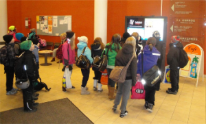
A public display being used by a group of children. Social context. Another important factor affecting the use of the displays is the social context. Some social settings foster interaction such as the situation illustrated in the photo. There a dozen kids have crowded in front of an indoor hotspot located at the entrance hall of the swimming hall, to pose together for an UBI-postcard to be sent to a number of friends. They retake the photo to be included in the postcard a number of times in a playful manner, until they are jointly satisfied with the outcome. While most of our services are single user services, we often observe people using the hotspots in pairs or in small groups and in a playful manner. Our sole “multi-user service” is the UBI Mosquitoes game where the objective is to smack mosquitoes and flies but not butterflies – kids often play it in groups as the more hands are available the better the chances.
Some other social settings prohibit interaction with the hotspots. An interesting pattern we have noticed in our data is that although on some days the number of people nearby a hotspot rose sharply (detected using Bluetooth), yet usage of the hotspot plummeted. Our observations and analysis suggest that this counter-intuitive effect has to do with the nature of the events and the placement of hotspots. In one particular example, a prom-like event took place at an indoor location where our hotspot was present. In trying to explain why its usage plummeted, we identified that on such events people arrive to the location with the specific purpose of joining that event, and they were most likely in pairs or small groups. This would reduce the chance that one person would break away from the group and stay back to use the hotspot while the others in the group went ahead and joined the event. The large numbers of people during the event also meant that the placement of the hotspot was actually not appropriate for rather dense situations, particularly because people standing in front of the display to use it are likely to block the flow of people and cause discomfort to others. Finally, our observations suggest that some people use the hotspots in order to “kill time”, something which is less likely to happen during special events.
- Weather. Finally, a further contextual element appears to have an effect on people’s use of our public displays: weather. Over the course of our deployment we mapped average daily temperatures and weather conditions (sun, cloud, rain, snow). Our empirical evidence suggests that sunnier and warmer days correlate with higher usage of our system, in terms of number of clicks, numbers of services launched and amount of time users spend interacting with the system. Specifically, a correlation analysis suggests that about 10% of the variation in usage is attributed to variations in ambient temperature alone, discarding other variable such as time of day, day of week, or even location. It is interesting to point out that these effects were simply not captured by our lab studies taking place in the comfort of an indoor environment with controlled lighting and temperature.

Publications
[bibtex key=Katsanos:InternationalJournalOfHumanComputerInteraction:2014,Kostakos2013,kukka2012not,Ojala:Computer:2012]