We have developed multiple tools to visualise and analyse urban mobility on a city scale (links to live demos at the end of the post).
Tools to visualise urban mobility
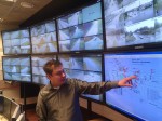
In our work we engaged with the city of Oulu’s traffic control centre responsible for day-to-day traffic management, but also with the environmental agency responsible for long-term transport planning in the city. In the process we conducted observations, interviews and a focus group. The traffic centre is a joint task force between multiple city and national agencies, including transport operators and the police. Their main responsibility is the real-time monitoring of traffic conditions across the city and operation of all associated systems. This is achieved with the use of remote-controlled video cameras that are installed at multiple junctions across the city. The video feeds are the primary means by which operators monitor traffic. All software and hardware systems are owned and managed by the street and road authorities. Finally, the control centre is responsible for coordinating emergency response relating to traffic accidents, and adjusting the traffic light priorities to deal with congestion.
Through a co-design process guided by the capabilities of our technology and feedback from the domain experts we iteratively designed three tools. These tools were developed with both desktop and wall-sized display in mind, to account for the variability in screen sizes in the control center. First, we designed a tool for generating overview visualizations of traffic conditions across the city, both live and historic. The controllers’ current practices are to visually inspect distinct visual feeds from the numerous cameras. This can be a challenging task due to the sheer number of feeds. While the cameras can provide very detailed information about situations at particular locations, there was also a need to for a quick-glance overview of traffic conditions across the city centre, but also a need to explore historic data, particularly recorded during major events.
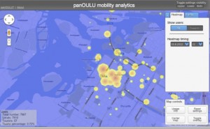
 The heatmap tool provides a quick-glance overview of traffic conditions across the city. The visualization can switch between showing data from the WiFi mobility traces and the inductive loop data, as long as the data consists of geo-located volumes of “activity”. When the visualized data is number of clients connected to particular WiFi access points during a particular period, then the “activity” of the heatmap represents pedestrian mobility. Conversely, visualizing the data from the loop detectors represents vehicular traffic activity. The tool allows the definition of date ranges, and therefore historic as well as real-time views are possible.
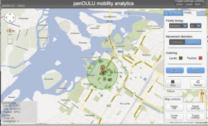
 The second tool we designed focused on conducting live and historic catchment area analysis. This tool is inspired by a manual technique used by urban architects, and consists of defining locations of interest (such as the train station or the main square) and recording all patterns of movement away from that area, or towards that area. Often this data is recorded manually by shadowing pedestrians in situ, and is used to identify how inhabitants use their city: which paths do they take, which roads do they avoid, and in general how they move through the city. This data can provide insights to urban architects and developers, particularly at the planning stage, to identify patterns in inhabitants behavior that they may want to consider when redesigning/rebuilding large urban areas like train stations or parks. Our tool was designed to conduct this kind of analysis with pedestrians both for real-time and historic analyses, aimed at exploring how pedestrians arrive to, or depart from, major events and central locations. As the operators noted, while cameras are able to identify individual cars and pedestrians it is not possible to do this for an individual across multiple locations and camera feeds. The tool, therefore, is a first attempt at capturing fine-grained travel information, and addresses an unfulfilled need of traffic operators: fine-grained replay of traffic flows across the city.
The catchment area tool works as follows. The operator defines a particular area by clicking on the map. Subsequently, a radius for that area needs to be defined by dragging the cursor. Given the definition of a particular area, and of a particular period, the system looks at the WiFi mobility traces and identifies devices that were detected at that particular location during the particular timeframe. The system then identifies for each device the ultimate location where that device was seen during the time window. The system visualizes one or many devices as a circle, and then animates all circles and moves them from the origin location (the one defined by the operator) to the destination (the ultimate location where the device was detected). The animation effect gives the operator a visual representation of how individuals at a particular location move, but is also able to highlight large-scale patterns. For example, the tool can show how individuals detected at the train station move within one hour. In addition, we have begun developing various filters that operators can use to color individual circles. Our first filter has been used to differentiate between residents and visitors. This requires an historic analysis on the mobility records for individual devices. Using a small set of heuristics, we essentially define visitors to be devices that have only been detected for a few number of days over a period of one year. On the other hand, devices that are more frequently detected over long period of times are labeled as locals.
 Finally, we identified the need for easy exploration of historic and real-time traffic patterns. Currently, operators have access to such data but exploration is made cumbersome because the tools require the definition of queries to retrieve the data and analysis relies on spreadsheet software. A critical shortcoming of this approach is that operators were not able to conduct geographic searches with using direct manipulation, but had to copy-paste the results of their search queries into a spreadsheet. This was also an important need of planners who are more focused on long-term analysis and strategical long-term interventions to the traffic network.
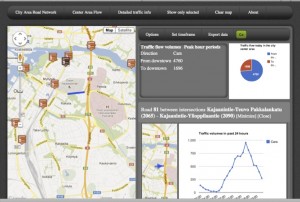
The third tool we developed allows the operator to explore traffic data historically and geographically. It is driven by a map that contains markers for all potential data sources. The operators are able to click on a particular data source, which can either be a road segment or a junction, and subsequently look at the data associated with that particular source. The tool gives operators the ability to define a specific period, and then plots dynamically the volume of activity detected by the particular data source during the period. The tool provides a “results log” section in the right side of the screen. The user can temporarily store the graphs and build up a series of graphs to facilitate exploration and comparison. This means that the dynamic nature of the tool does not result in graphs disappearing when new data sources are clicked.
Publications
[bibtex key=kostakos2013traffic]

