
In recent years there has been a lot of buzz about two important ways to understand communities and their behaviour
- through what they do online, and
- through where they go.
In our research we have identified evidence that these two are strongly linked, and we identify a set of fundamental driving forces that shape our behaviour and movement.
Two ways to study communities
Various online services can be used to make predictions about “offline” events. Trends in online search activity (i.e. what people search for in Google) have been shown useful in providing models of real world phenomena such as influenza outbreaks, stock market activity, and consumer behavior. One example is the search volume of the keyword “flu” which correlates with the outbreak of influenza as recorded in national health statistics. In other words, as more people search for the word “flu” in Google, we can expect more people to be infected with influenza. Therefore, these models typically rely on the careful choice of search keywords that are expected to correspond with a particular real-world phenomenon.
Another important way that scientists use to infer population behaviour is through the study of mobility. Research has shown that the study of urban mobility can offer insight into human behaviour such as social interactions and an understanding of people’s daily routines. In other words, by looking at how communities move we can understand them better.
Can online behaviour be used as a proxy for studying urban mobility?
In a paper we recently published at PLoS ONE we show that, in fact, online behaviour can be used as a proxy to study urban mobility itself. In other words, we show that these two facets of a community’s behaviour – what they search for and where they go – are strongly linked. This important finding provides grounds to hypothesise that many more aspects of human “offline” behaviour can be identified using online data, as long as we know what to look for. As long as we are able to find the right keywords then we are able to study a wide range of offline phenomena.
Summary of our work
We provide here a very brief and informal summary of our work. There are many more details and results in our paper. The first important step in our work is to obtain access to an amazing dataset collected by the operators of a free, open, and public WiFi network in the city of Oulu, called panOulu. This is a large city-wide network with more than 1300 access points (Figure 1). Due to the way WiFi works, the network has to keep track of which devices are connected to which access point, and at what time. What this means is that for any single location where this WiFi network is offered, you can keep track of how many devices connected over time.

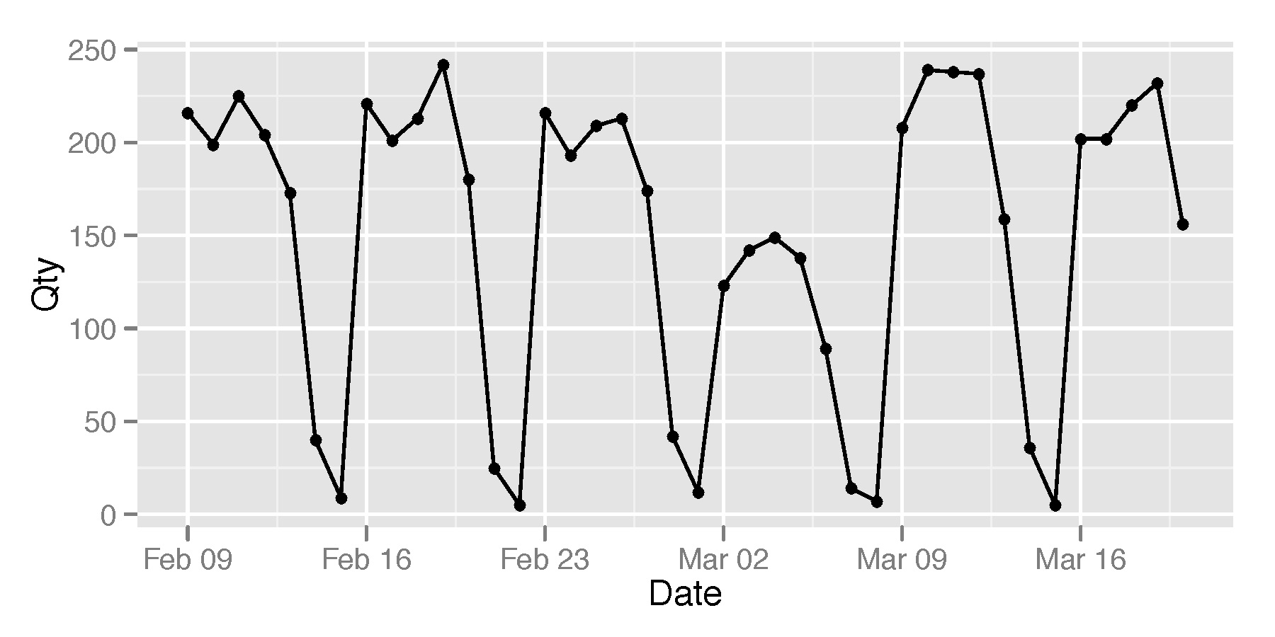
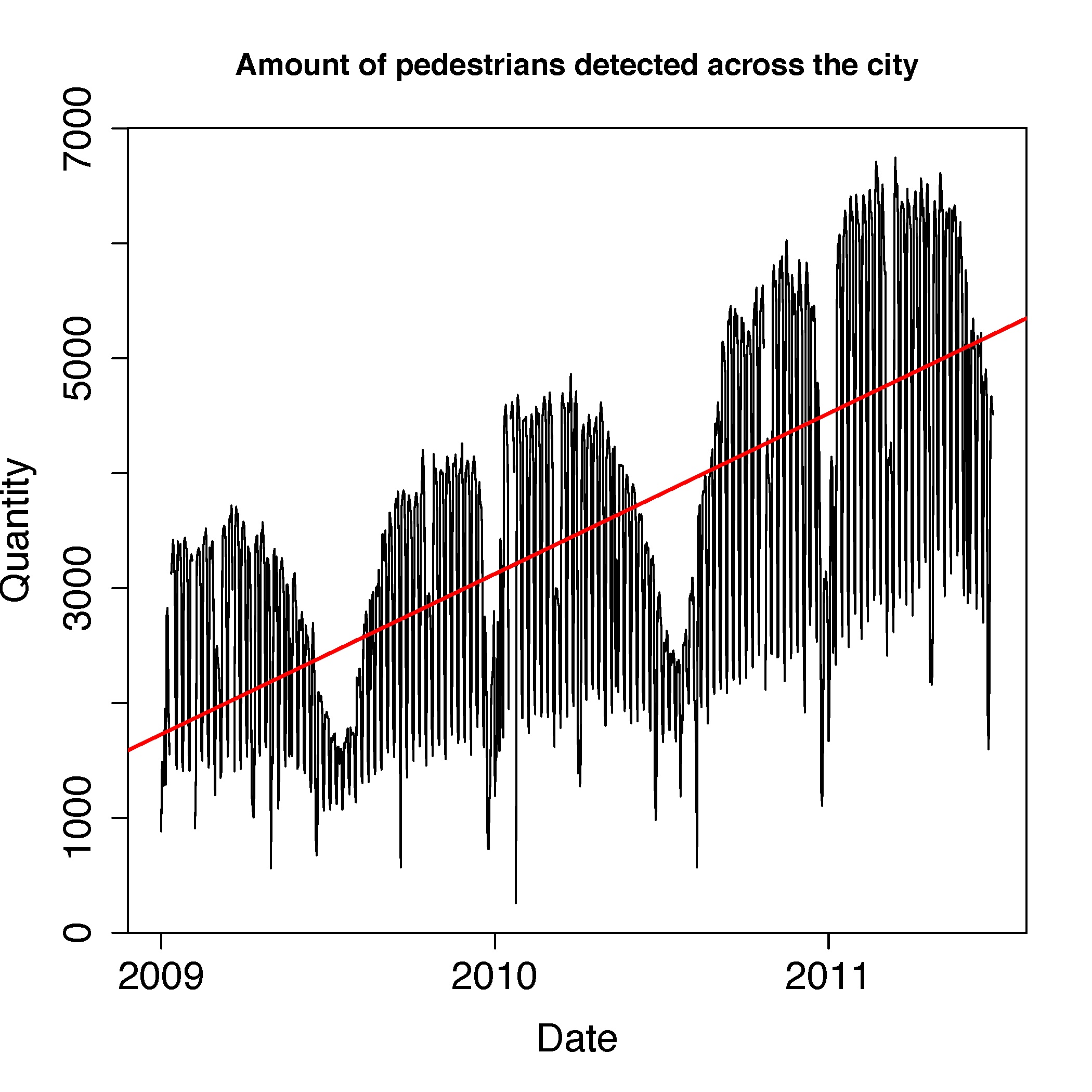
So the first thing we did is tally up all those numbers over a long period of time – 3 years, and over every single location in the city. The data showed strong weekly patterns (Figure 2) reflecting sharp drops in activity during weekends, but also strong annual patters (Figure 3) with sharp declines during the summer when everyone leaves the city to go on holiday. In addition we found an upward trend over time, showing that more and more people use the WiFi network in our city.
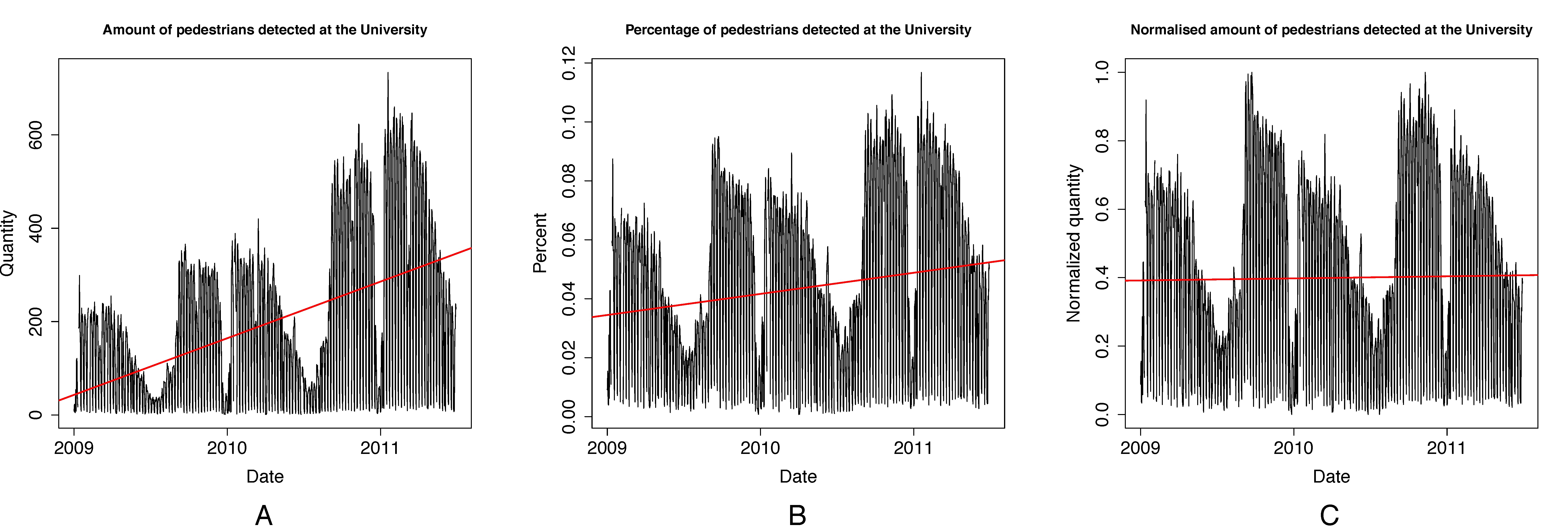
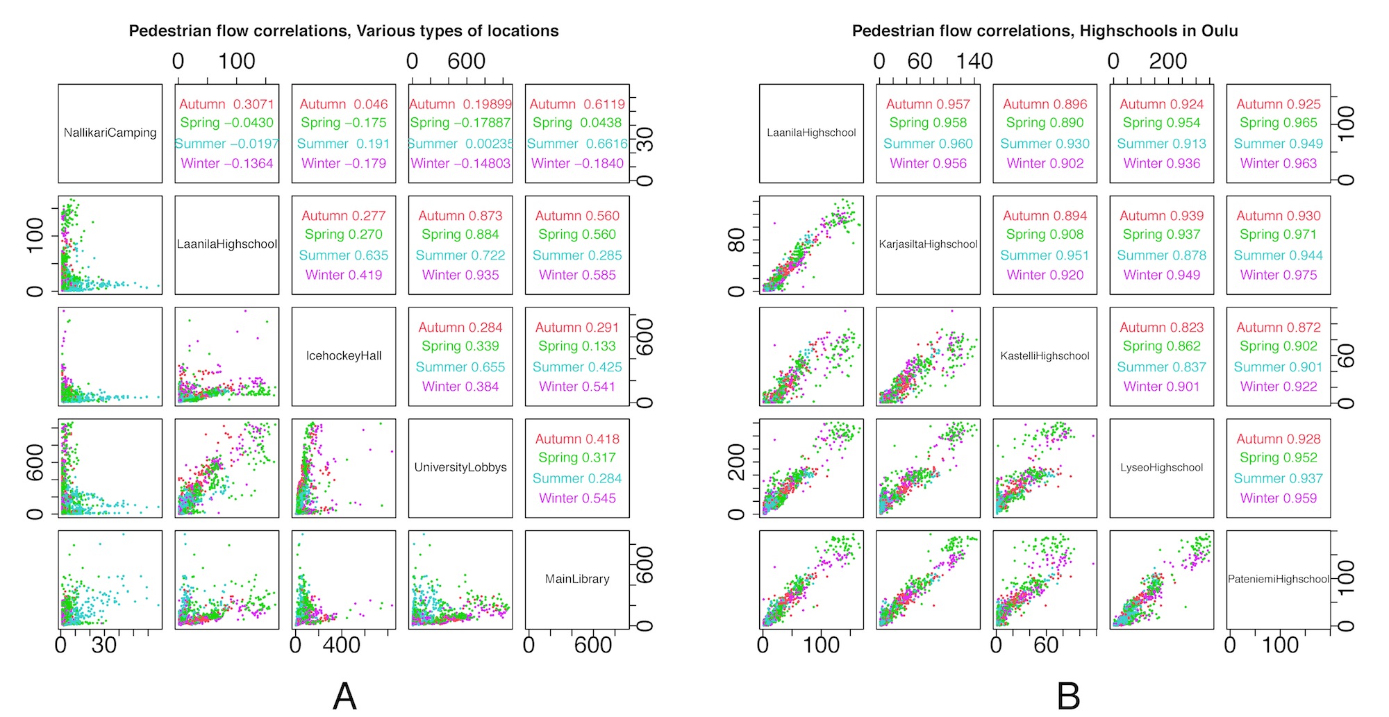
The next step in our analysis was to identify a set of locations for further investigation. We focused on our own university campus, some schools, the library, and a sports arena in our city. For each of those locations we first derived a graph like the one shown in Figure 3, but then we applied a gradual normalisation process as shown in Figure 4, which removes the increasing trend in the data but retains the seasonal and weekly patterns.
At this point in our analysis we had a set of normalised data that describe how many people visited particular locations over a 3-year period. We entered this normalised data into Google Correlate, a free online tool that allows anyone to upload time-series data and identify search queries whose popularity matches the time series. For example, if you upload a time-series that shows a sharp peak in early February, then you will get keywords that relate to Saint Valentine’s day. This is the same technique that researchers had used to match the outbreaks of influenza with the keyword “flu” amongst others. In our case, we uploaded our normalised data on how many people visited the locations we were studying over a 3 year period, and then pressed the “Submit” button to see what comes out. What came out (Figure 5) was unexpected, puzzling, and “worked like magic”!
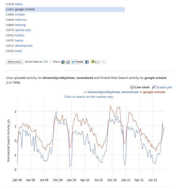
What we noticed is that the keywords returned by Google Correlate semantically matched the locations from which we collected the data. How could that be? All we uploaded to Google Correlate was time-series data: pairs of numbers showing the date and the number of devices counted at a particular location. The data did not contain any hint of where the data was collected, no GPS coordinates, no textual description or name of the location… Just numbers. Furthermore, Google Correlate analysed data from the whole of Finland, not per city or per neighbourhood. And yet, Google Correlate was returning keywords that semantically matched the locations where we collected our data.
For example, when we uploaded our data from our own University lobby (that is, how many people used the WiFi network each day at the university lobby over a 3-year period), the top-10 keywords we got from Google Correlate were:
- Helka (Helsinki university library) 0.914
- google scholar 0.895
- scholar 0.894
- tutkimus (research) 0.893
- learning 0.887
- optima oulu (student environment) 0.878
- funktio (function) 0.876
- luento (lecture) 0.874
- development 0.872
- nelli (university e-library portal) 0.871
We have translated all the keywords above (if they are originally in Finnish), and we have contextualised and explained many of them. The decimal number shown next to each keyword is how well the keyword’s time series matches the time series we uploaded. Using this score, we can identify the top-10 keywords which we show above.
Magic or nature?
Our next step was to try and explain the results we were getting. How could it be that a computer system can take a set of dry number and infer contextual information about that location? A further question we had was how could Google Correlate, which operates on national search volumes identify and match patterns that are derived from highly localised locations and populations (i.e. the lobby of our university).
Our hypothesis was that the only way this “magic” could work is that if across Finland, all university lobbies experience the same fluctuations over time. This almost makes sense: most universities do have similar opening and closing patterns, and by implication the volume of people visiting universities changes in tandem. If that was indeed the case, our hypothesis goes, then all people across Finland who use Google and physically visit these universities would change their behaviour simultaneously and in tandem. Thus, there is nothing special about our own university lobby: it is just one instance of a university lobby archetype, or an instance of a type of location, many of which exist throughout the country. Thus, we reach the logical hypothesis that there must exist many location archetypes, with each location archetype having multiple instances across the country, and each instance experiencing the same fluctuations in visitor volumes as other instances of the same archetype.
This hypothesis is the only way we could try to explain how the visitor volumes we collected from particular locations in our city (such as our university lobby) could result in semantically relevant keywords when analysed with Google Correlate — a tool that operates strictly on national data. To test this hypothesis, we needed to collect data from many locations which could all be said to belong to the same location archetype. Sadly we only had data from one university, so we could not use that. Thankfully, however, our data contained many high-schools spread throughout the city. So we set to analyse this data, and investigate whether their visitor flows do indeed fluctuate in tandem over time.
In Figure 6 we show that this is indeed the case. What we show is that when we compare the visitor flows – per day over a 3-year period – between highschools (which we believe belong to the same archetype) we get much higher correlations than when we compare locations that are not semantically related (and therefore belong to different archetypes).
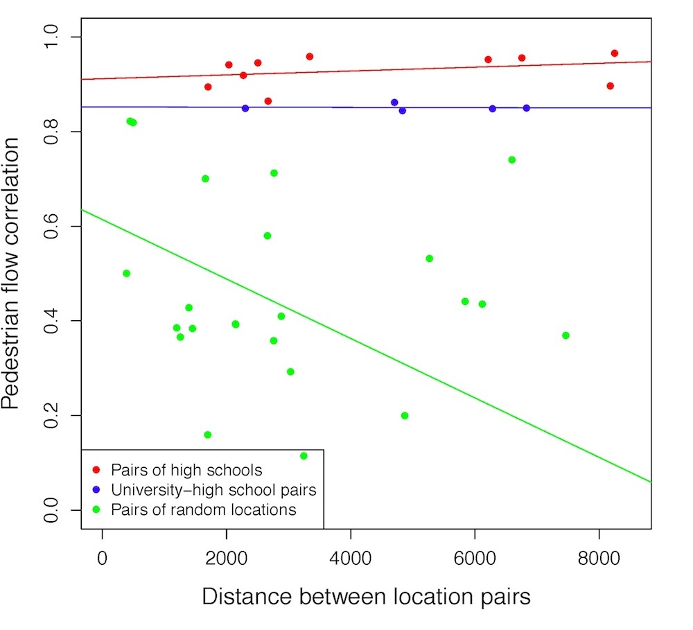
However, there was still one possibility that our analysis did not account for so far. Because the flow of visitors is a physical phenomenon, it has physical properties such as momentum. This means that if we were to collect data from two locations that are very close to each other, we would get very similar results because flows move. So what our analysis did not account for at this point is the physical distance between the various locations whose pedestrian flows we were correlating.
To address this concern, we started taking into account the physical distance between the pairs of locations we were comparing. Our hypothesis was that if two locations belong to the same archetype then the distance between them does not matter. On the other hand, for locations that do not belong to the same archetype, we expect that distance plays a big role in how pedestrian flows fluctuate over time. This is exactly what we were able to show in our analysis, for instance looking at Figure 7. In this figure we see that for pairs of locations that are semantically similar (red and blue dots) distance does not have a big effect on the correlation of pedestrian flows: regardless of the physical distance between such locations, the correlation is high. However, when we look at pairs of locations that are not semantically similar (green dots), then the farther away they are from each other, the less they are likely to correlate in terms of pedestrian flows.
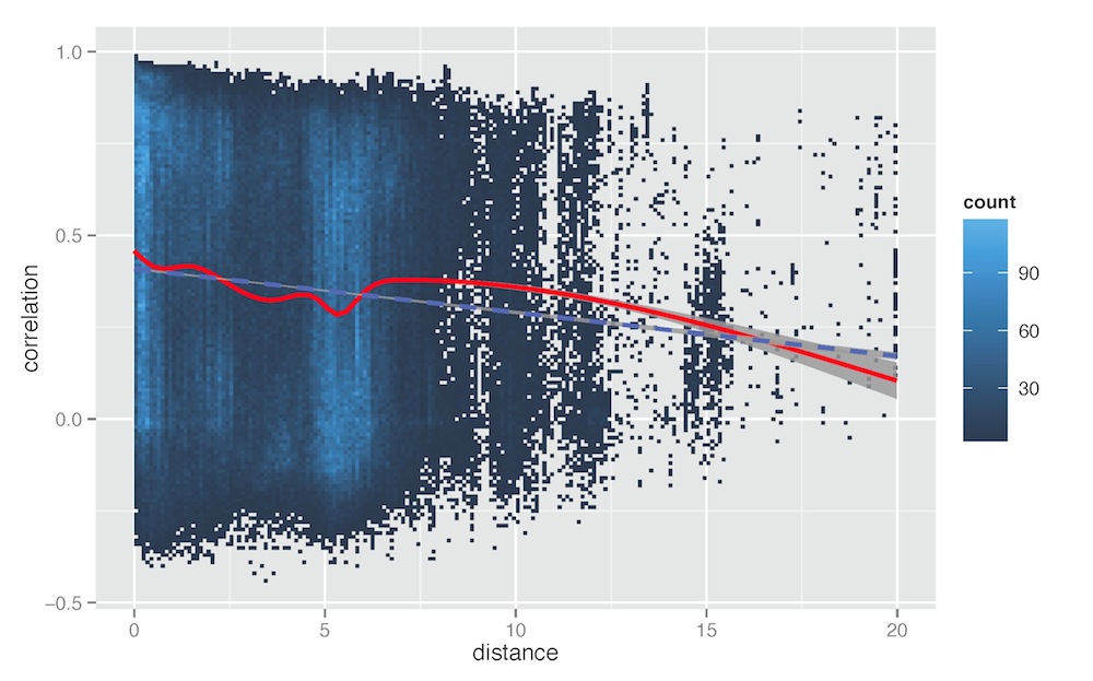
To further validate this result, we conducted a pairwise analysis of all access points in our network, using daily samples for the 3-year period. For each pair of locations we calculated the correlation in pedestrian flows during that period, as well as the physical distance between those locations. The results of this analysis are shown in Figure 8, which exhibits a strong downward trend for pedestrian flow correlation as distance increases.
Conclusion
Due to the nature of our work with location archetypes and keywords, we have begun calling this type of analysis LAKE analysis: Location Archetype Keyword Extraction. The results from our work so far demonstrate two important findings. First, we demonstrate that LAKE can be used to identify keywords that strongly correlate with urban mobility at particular locations. This means that in the future, monitoring the popularity of these keywords can indeed offer insights into the pedestrian flows of that particular location. An important benefit of this approach is that it can be cheap and convenient to collect data on keyword popularity on large scale, thus making this analysis more accessible.
A second, unexpected, finding of our work is that the keywords produced by LAKE are semantically relevant to the respective locations. We have conducted verification with human raters and confirmed that indeed the keywords LAKE produced are semantically relevant to the locations. In some cases this semantic relevance is contextually derived, so we would expect only a resident of our city to be able to identify this relationship.
Ultimately, our work provides evidence that there is a strong relationship between how people Google and how they move. And because the places we visit tell a lot about who we are, what we do and what we like, finding their right keywords to monitor in Google searches can provide powerful insights into communities’ behaviour.
Publication
[bibtex key=10.1371/journal.pone.0063980]